Between now and New Year’s Day there is a mouthwatering nine Premier League fixtures for each club. This will bring rotation galore and desperate refreshes on twitter to see team news; is your captain playing? Has Anfield Express got it right? Has Jamie Jackson had another brainwave? And just what is Guardiola doing this week?
Some of the clubs twitter team announcements are clear and informative some are a shambles. See below for the league table based on clarity of information, team news and the fixture. Points were deducted for how easy it was for a tweet to be retweeted 4 months later to fool everyone.
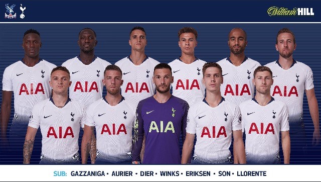
20. Tottenham Hotspur
No names. Is that Alderweireld or Kane? What does Ben Davies actually look like. Presumably Daniel Levy has organised the twitter team sheets to be finished with names by January. Or March. Maybe next season?
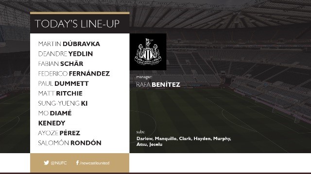
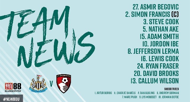
19. Newcastle United
Plain, boring, no flair. In the relegation zone due to no information about the fixture, making it easy to retweet four month later making you think Ayoze Perez is playing today. Mike Ashley had a meeting with a social media expert but only offered them £6 an hour before vomiting into a fireplace.
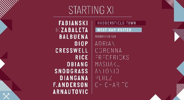
18. West Ham United
Drop into the relegation zone on the last day thanks to hard to find fixture information and don’t get started on the font for those substitutes.
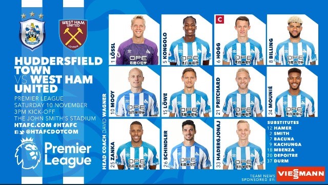
17. Huddersfield Town
Narrowly avoiding relegation due to the the fixture info and date on the left hand side. The team line up is awful. A modern curse of doing line ups in squad number order, is Mounie dropped? Or is he playing holding midfield?
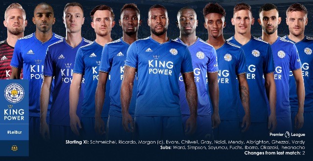
16. Leicester City
Similar to the Tottenham line up but with added player names. Hardly any fixture information means a relegation battle for Leicester.
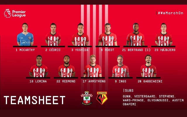
15. Southampton
Uninspiring. Mark Hughes refused to shake the graphic designers hand then blamed the referee.
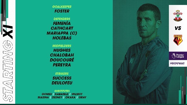
14. Watford
It’s not actually clear whose team line up this is. A relegation battle only avoided by the presence of the positions of the players. Not sure who the guy on the right is either? Ah that’s what Javi Gracia looks like.
13. Bournemouth
Not a bad effort really, but a lack of clarity of the date leaves it open to someone retweeting the line up as a hilarious joke over Christmas when Wilson is rested in after scoring a hat trick. Pretty but not consistently effective. What do you mean it’s like the team?!
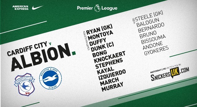
12. Brighton & Hove Albion
Diagonal writing. Decent enough but forgettable. What do you mean it’s like the team?!
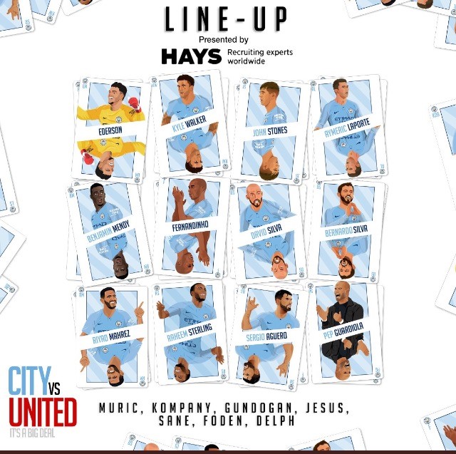
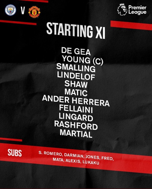
11. Manchester City
Chaos. Playing cards are stylish enough but simply not acceptable for a club who rotates 11 million pound FPL assets for fun to have no clear information about the fixture. Guaranteed to be an old team retweeted when Aguero is finally benched at home to Palace as Gabriel Jesus scores 4. Rumours the graphic design team are paid via illicit means are entirely unfounded. Honest.
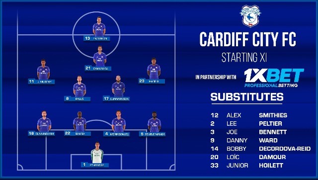
10. Cardiff City
A strong formation based effort could have seen a title challenge by Warnocks men. But small font on the starters and lack of opposition means our captain Paterson picks will be sweating as we clarify if it’s today’s team. Still at least no one died eh Neil?
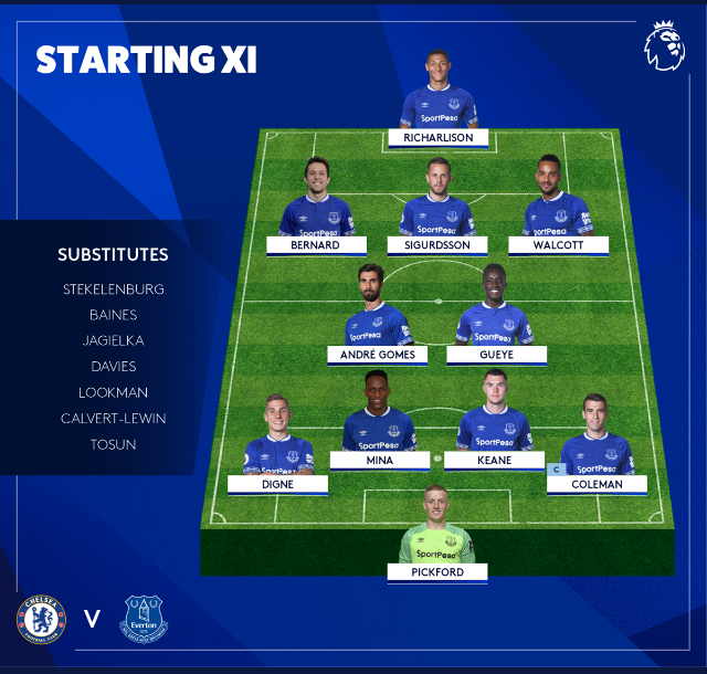
9. Everton
Again a strong formation effort and great font should have seen a title challenge. No opposition means mid table for Silva. BeIN sports will have a one hour special with Keys, Allardyce and Thompson about English graphic designers not getting a chance and only sexy, sexy foreigners getting a go.
8. Manchester United
Strong clear team news. Let down by obvious date and opponent information. Nearly a good effort, but not quite the sum of its parts. Rumours that Jose wants a 89 year old graphic designer, whilst the board are looking to spend £5 an hour on one are totally unfounded.
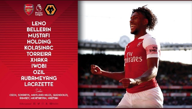
7. Arsenal
Classy font and design make it a real title contender. Unfortunately still a few details missing due to the inability to sack the previous French social media expert after years of poor performance.
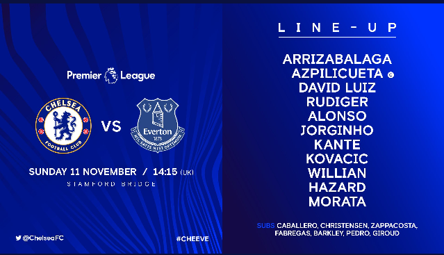
6. Chelsea
A stylish blue effort only missing out because of the small opposition badge. May struggle next year when their Belgian head graphic designer leaves for a new role in Madrid.
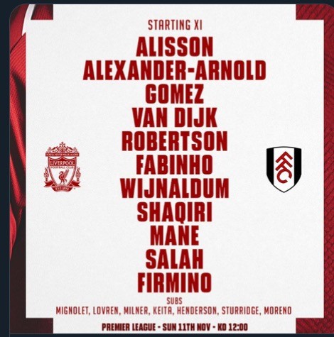
5. Liverpool
A strong stylish effort, only missing out on top spot due to the lack of opposition name and the fact Anfield Express tweeted the team out ages before. The German Kevin Keegan director of graphic design assures us that with the addition of two more ninety million pound designers, next year will be their year. Honest.
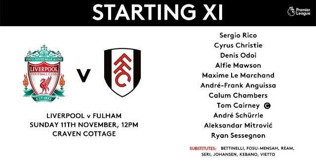
4. Fulham
Lovely quaint effort. All team news clearly offered, all dates, opposition times all available. Only misses out on a title spot because of the stadium error in this example and no one actually needs to check Fulham team news.
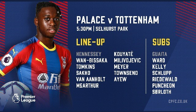
3. Crystal Palace
Lovely font, lovely design, clear bold team names. Only missed out on top spot because of a lack of a date. An investigation has been launched after accusations of Wilfred Zaha working alone 23 hours a day all year with no holiday in the social media office as no one else there is able to contribute.
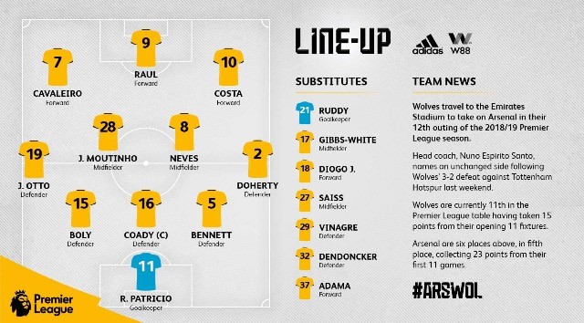
2. Wolves
Team formation effort with names, top spot only denied by the fact the relevant fixture info is buried in an essay.
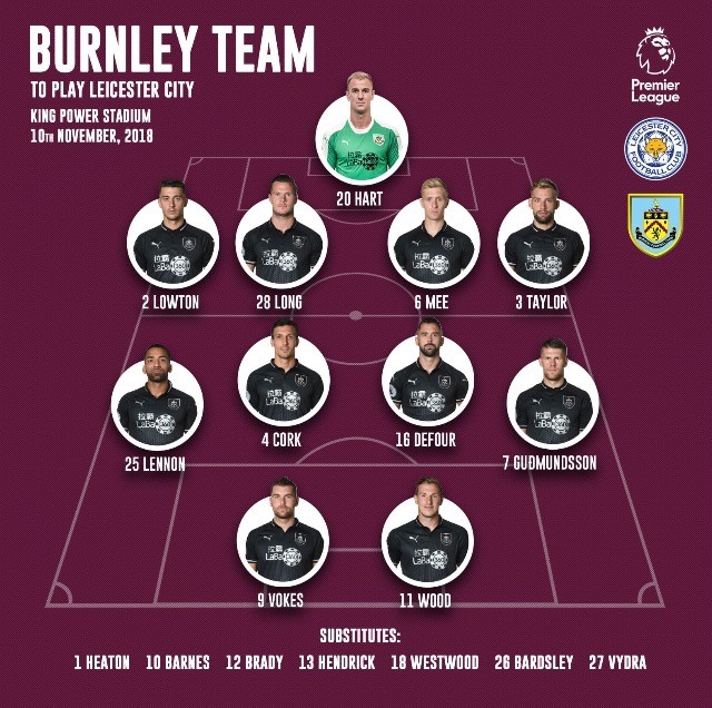
1. Burnley
Champions. Suberb effort. Purple branding, formation team news, opposition name and badge, date, stadium. Perfection. Will make a song and dance about not giving this trophy to Richard Scudamore before melting it down and giving him the proceeds.
